In this section, the best explainable visualisations to explain pattern and trends are displayed. Specifically, this section will help you to suggest how to clarify pattern and trends by extracting meaningful insights.

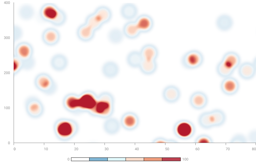
A heatmap is a visual representation of data in the form of a colored matrix, where colors indicate numerical values in the matrix cells. Typically, more intense colors represent higher or lower values depending on the context. Heatmaps are used to highlight patterns and relationships in data, making it easier to understand trends. They are often employed to visualize the correlation between variables in a dataset or to represent the distribution of values in a matrix.

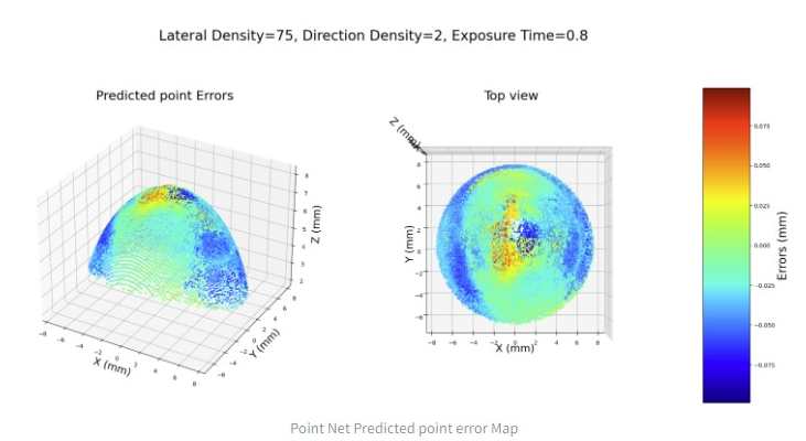
A 3D heatmap representation has been used in XMANAI to highlight the predicted measurement error on a spherical surface. The 3 axys (x, y, z) constitute the 3d space – expressed in mm – in which each error point is represented. The points are represented in a specific point of the space using a gradient color scale to identify the intensity of the error.


XMANAI Project Coordinator
Michele Sesana – TXT
e-mail: michele.sesana@txtgroup.com
XMANAI Scientific Coordinator
Dr. Yury Glikman – Fraunhofer FOKUS
e-mail: yury.glikman@fokus.fraunhofer.de
XMANAI Technical Coordinator
Dr. Fenareti Lampathaki – SUITE5
e-mail: fenareti@suite5.eu
TXT e-solutions S.p.A.
Via Frigia 27 – 20126 Milano
t: +390225771804