The CNH of Italy tractor plant, located in Modena (Emilia-Romagna), is currently manufacturing APL and APH drivelines that are used to equip the tractors that CNH will assemble in its assembly plants worldwide. The average annual production of the plant is 60K Drivelines, which are supplied to the final assembly plants of St. Valentin, Jesi, Noida. In addition to shipping drivelines, it also ships front axles components and cabins worldwide.
To manufacture the tractor components in any of the different variants, the plant has suppliers producing the raw parts to the machining lines depending on the 3d – 2d models and the derivative to be manufactured. To manage the variant’s manufacturing complexity, the plant is working with batches managed manually using the experience of MPL and production personnel.
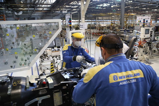
Figure 1: CNH Office
Description of the Objetives
CNH is a world-class equipment and services company, is a global leader in the design and manufacturing of agricultural and construction machines, that employs more than 64.000 people in 66 manufacturing plants and 54 R&D centers in 180 countries. The collaboration with European partners of the XMANAI project was developed within the San Matteo plant, located in Modena, Italy. It is the most relevant R&D unit in the field of tractors in Europe, using the most advanced technologies for design and engineering purposes.
The use cases focus on Modena Plant which is currently manufacturing 60K APL and APH (All Purpose Low – High Tractors) drivelines used to equip all tractors assembled in CNHi plants worldwide. Drivelines mainly supply the three different final assembly plants: St. Valentin (Austria), Jesi (Italy), and Noida (India).
Today production lines are affected by unplanned and planned stoppages that reduce their availability; such stoppages are typically required to replace worn or faulted components (i.e., tooling), or to maintain proper manufacturing conditions.
Currently, the unplanned stoppage is managed without a connection with an intelligent monitoring system that could improve the probability to reduce the time and costs related to managing the stoppages.
Furthermore, inexperienced operators must reset the machine without the proper knowledge and support from expert ones. In this case, the correlation of the intelligent monitoring system with a digital support tool can be useful to restore the fault without calling an external maintenance operator saving time and costs.
Figure 2: CNH factory
Figure 3: CNH Product
Use Case
The case studies selected by CNH focus on the Modena production plant in Italy! In particular, the use case focuses on machine downtimes that stop production for long periods of time, this means for sure a waste of time but most importantly a waste of costs for the company that could be avoided. Downtimes are usually due to the replacement of defective parts or maintenance.
At times, due to job turnover, inexperienced operators should reset the machine without the proper knowledge or support from an expert one.
In detail, in the current state when the machine stops, the operator must exclude different parts of the machine step by step to get to the faulty component; so the operator in this way wastes a lot of time to understand the root causes of the downtime.
With the use of XMANAI’s platform, the user will be helped to solve the diagnosis of the machine error with the support of AI suggestions that will be based on the values of the sensors installed on the machine that monitors its operational status. And if the operator is inexperienced, he will have a digital tool to help him replace the component with a step-by-step explained procedure.
The second use case regards forecasting. The operator, thanks to the support of the platform, will be able to get suggestions as to which components might reach the end of their life soon.
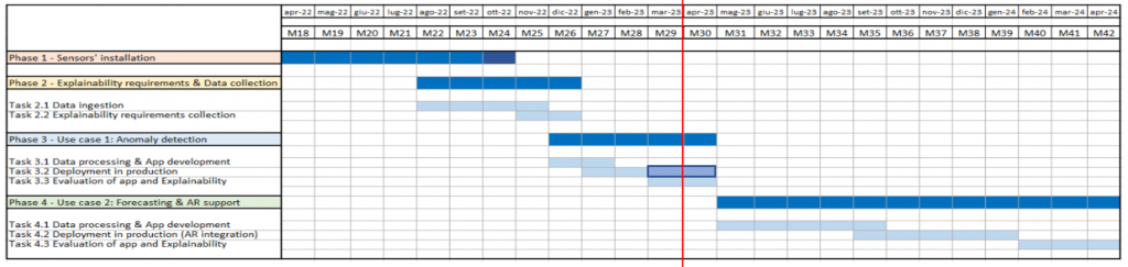
Figure 4: Planning of the CNH demonstrator
As visible in the Gantt above, we are currently in the final part of the phase 3 related to the first case study with the development of the web-app that monitors the operational status of the machine and informs the operator of the correlation of the various sensors to a potential machine fault.
Explainability Expectations and Take-up
Data description
The data source identified derives from a series of HELLER machines which is present in the Modena plant shopfloor on an island consisting of 4 Heller 400, which are four-axis work centers for CNC mill/turning centers.
One of these machines is equipped with 76 sensors that collect data regarding:
the 3 axes (X, Y, Z) frequency acceleration
3 axes (X, Y, Z) frequency speed
Electrical panel
Air consumption
Pump
Mandrel
The first dataset is available from 01/01/21 to 01/08/21; is it possible to access historical data from 2017.
Concerning structure, the dataset is composed of Time series data gathered from 76 different sensors, which can be divided into 12 groups (categories). The data from each sensor has different timestamps, and only a few data points are available for each day. Finally, the sampling rate for each sensor is irregular every day and the dataset is unlabeled.
Concerning the input format, instead, the assets are stored in tabular format as time series key-value pairs. The data is completed with the name of the sensor for which the value was recorded and the measurement unit of the related physical quantity.
Data velocity is batch-based on the machine cycle, as the data are collected by sensors during the execution of an empty cycle at the end of each production cycle. The comparability and veracity of data are assured by the fact that data are collected by sensors during the execution of an empty cycle at the end of each production cycle. In this way, sensor data are not affected by the differences in materials and work orders. Finally, data volatility is guaranteed by the fact that the Heller machinery is a stable configuration object such that data is valid for the whole life of the machinery and similar ones.
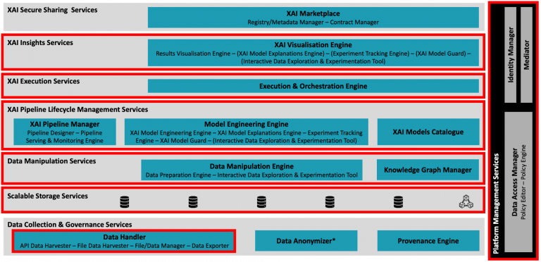
XMANAI platform components
The figure below shows an overview of the components constituting the XMANAI cloud platform. In particular, the components surrounded in a red box are being employed in the context of the CNH demonstrator.
Figure 5: XMANAI platform components usage
Starting with the XAI Insight Services, are used early to perform tests on the models and the training data to understand the challenges related to the use case realization. The XAI Execution Services allow to execution of the XAI algorithms experimented earlier in a robust production-ready environment, once the models have been finalized. Moving on to the XAI Pipeline Lifecycle Management Services, those are being used in all aspects of the process, in order to securely create, schedule and monitor the execution of XAI pipelines. The Scalable Storage Services are used both as the source of input data to be processed and to store the refined data undergoing the process of data ingestion. Those are further utilized to keep the trained models and the associated prediction. Moving to the Data Collection & Governance Services and, in particular, to the Data Handler category, the File Data Harvester component finds particular use to ingest the raw machinery data in the proper format, following the CNH data model and ensuring type consistency. Finally, the platform management services are used to guarantee the security and authorization of the users in the platform, allowing access to data and pipelines only to CNH and the supportive partners of choice.
It is important to highlight that, although some of the components haven’t been marked as used, they are exploited indirectly through other components of the XMANAI platform. The above description only refers to the components used directly in the realization of the two use cases.
Another crucial aspect of the use case is the choice of the model to be used in order to accomplish the described tasks with the support of the XMANAI platform. The model must be well-performant with multiple irregular time series of different lengths. It also has to keep into account the possibility of adding new sensors in the future without compromising accuracy or forcing to homogenize data every time. For all these reasons an isolation forest approach was identified as the most suitable to use. This algorithm selects a feature and then randomly selects a split between the minimum and maximum values of the selected parameter. The core idea is that many splits are required in order to isolate a “normal” point while a small number of splits are required to isolate an anomaly. The sequence of splits that brings to an individual data point is called a path. Depending on the path length, an anomaly score is computed and interpreted as follows:
A score close to 0.5 indicates a normal point.
A score close to -0.5 indicates an anomaly.
With this basic concept in mind, two approaches were attempted:
The first approach consists of fitting an Isolation Forest for each available sensor, then checking the results of the models on the day of the occurrence of the failure. Finally, build plots to visualize and interpret the results. This method allows each individual model to be fitted on the specific sensor, increasing accuracy, and making each prediction independent of the number of samples available for other sensors. This way, however, prevents the user to catch the correlation between sensors (since each model only refers to an individual sensor). For this reason, a second approach was proposed in order to mitigate this issue.
The second approach relies on fitting an Isolation Forest for each group of sensors and checking the results of the models on the day of occurrence of the failure. Finally, some summary plots can be built by exploiting the visualization capabilities of the SHAP library to interpret the results. The crucial aspect of this method is the selection of the groups; these should be large enough to allow the model to correlate together as many sensors as possible, while avoiding grouping sensors with too different time series shape so that only a few samples have to be discarded/extended to harmonize all sensors in the group.
The combination of the two approaches described, allows the overall process to be precise enough thanks to the individual models tailored for each sensor while providing good correlation information thanks to the categorization of the sensors. The visualizations produced by each of the two approaches are presented in the section below.
Examples of visualizations
The operators need from the algorithm suggestion on which sensors can cause the error of the machine. At that purpose, the plots chosen to help the worker in the explanation of the algorithm results are: Force plot, Bar plot, cohort plot and heatmap plot.
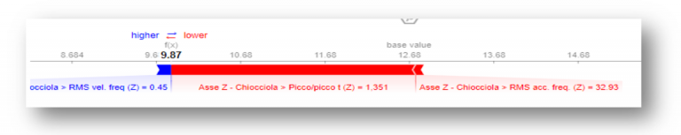
Figure 6: Force plot
The figure above shows the Force Plot for a particular failure, occurred in the Heller 400 CNC machine. It highlights all the sensors that have contributed to the failure and their respective influence. Red bars indicate a positive influence towards the anomaly, and the higher longer the bar the higher the individual contribution.
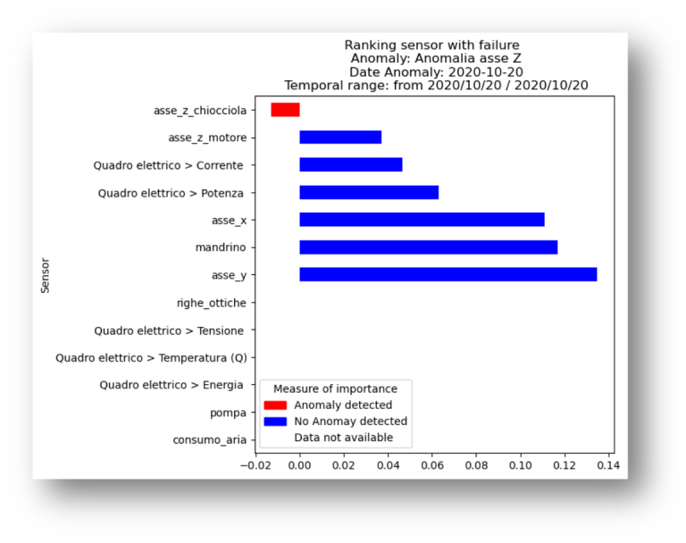
Figure 7: Bar plot
Similar to the Force Plot, the above figure shows the individual contribution of each sensor in the specifically selected anomaly. The values are sorted from most to least impactful, leaving empty values at the bottom. Like the previous chart, red bars represent the algorithm confidence of a particular sensor contribution in the specific anomaly, while blue bars indicate non-contribution. The wider the bar, the higher the algorithm confidence. The absence of data signifies that either the model is unsure about the particular contribution of a sensor, or no data was available for that sensor related to the anomaly under consideration.
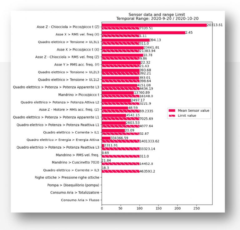
Figure 8: Cohort plot
The Cohort Plot condenses in an individual view the status of all sensors at the time a specific anomaly occurred. It shows the sensor value as well as its upper control limit. If no information about the sensor is provided, the corresponding entry is drawn as empty. If no information about the upper bound is provided, the sensor is omitted from this view.
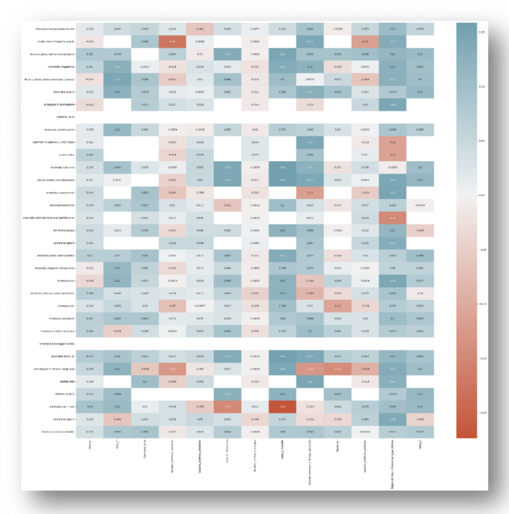
Figure 9: Heatmap plot
Finally, the above figure shows an advanced visualization that can be exploited by white-collar workers in order to gain more insights into the correlation of an anomaly and the possible sensors causing it. In order to achieve such a global view, the anomalies recorded have been grouped into different categories to make the visualization easier. Each of these categories is compared to every sensor value and a relationship score is assigned to each pair. The lower the value (color towards red) the higher the correlation; the higher the value (color towards blue) the lower the correlation.
Manufacturing apps being developed
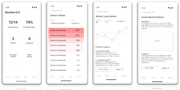
Figure 10: First mockup of the smartphone web-app
The aim of the web app is to give the end-user information about the operating condition of the machine being monitored. In detail, the Home presents information on the number of sensors that are active, the number of alarms/malfunctions, and the possibility to compare the trends of the various sensors and the history of machine faults. The ‘Sensor Values’ tab classifies the sensors according to the criticality of the specific fault, highlighted by an increasingly bright red color showing the increasing criticality of the fault. Clicking on the sensor opens another tab where it is possible to view its trend over time and compare different trends over time of several sensors. Finally, there is also a tab where the user can provide feedback on whether the platform’s suggestion was helpful in solving the fault or not.
Alongside the web app, there will be an AR application for assisting workers in performing the maintenance procedure
that will support the operator by suggesting the steps to be performed for machine recovery.
The first mockup developed referred to the AR platform shows an interface as intuitive as possible to assist the operator in solving maintenance problems that will help the explainability to take placed with the XAI algorithms.
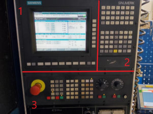
To develop the AR app mockup a preliminary study was carried out with the aim of better understanding the working environment in which the application is to be used. The inspection was necessary to draft an explainable AR interface. The operator does not have enough space to maneuver, and the device used will not be able to frame very large areas, which means that the dashboard had to be divided into 3 sufficiently small areas, how which is visible in the following figure:
Figure 11: Dashboard divided in 3 areas
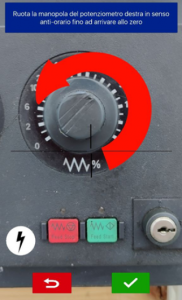
The three areas highlighted in Fig 4.3 are necessary to insert a QR code baseline for the AR guidelines visualization (such as. Arrow, Explanation Text, Buttons, or Icons are visible in the following figures.
Figure 12: Virtual element overlap the real machine to give suggestion and guide
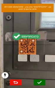
Figure 13: QR code colored for different part of the machine
Note: This is an early version of the app that will be replaced by the Weavr platform. Its intended use is in use case 2
Results
The benefit that XMANAI should bring to CNH is, in short, time-saving during the troubleshooting procedures.
Approximately a time saving of 30 percent or more passing through the actual status to the first use case and another 10% passing through the first to the second. So XMANAI for CNH means a visible reduction of the time to reach the faulty part saving costs for the company.
Other benefits the company expects to gain from using XMANAI are as follows:
Reduce emergency maintenance: XMANAI should provide a set of data to the user, to help him identify the problem before the critical moment arrives (like for instance the breaking point of a component); this could generate a predictive maintenance plan that reduces the emergency.
Reduce time/errors in machinery operations (maintenance/set-up/troubleshooting): XMANAI should provide suggestions with the description of the problem and visibility on how the problem has been identified, moreover it should suggest the maintenance/troubleshooting procedure to be executed and the parameters to be monitored during production. XMANAI should support the Blue-Collar Worker in doing the maintenance/troubleshooting procedures with AR/XAI connection.
Trust in XAI providing reduction of workload/stress of operators: XMANAI should provide an interactable HMI able to navigate data from different devices including PC, tablets/smartphones, and wearable AR devices.
The XMANAI website uses cookies. By using our website and agreeing to this policy, you consent to our use of cookies in accordance with the terms of this policy.
This website uses cookies to improve your experience while you navigate through the website. Out of these, the cookies that are categorized as necessary are stored on your browser as they are essential for the working of basic functionalities of the website. We also use third-party cookies that help us analyze and understand how you use this website. These cookies will be stored in your browser only with your consent. You also have the option to opt-out of these cookies. But opting out of some of these cookies may affect your browsing experience.
Necessary cookies are absolutely essential for the website to function properly. This category only includes cookies that ensures basic functionalities and security features of the website. These cookies do not store any personal information.
Any cookies that may not be particularly necessary for the website to function and is used specifically to collect user personal data via analytics, ads, other embedded contents are termed as non-necessary cookies. It is mandatory to procure user consent prior to running these cookies on your website.