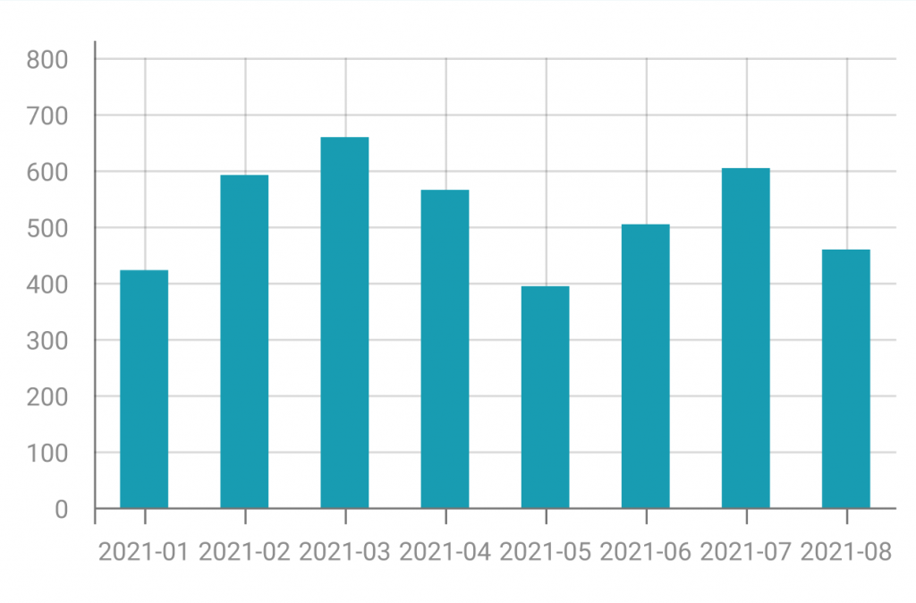
In this section, the best explainable visualisations to identify anomalies are displayed. Anomalies are deviations or irregularities in data patterns that stand out from the expected or normal behavior. This section will help you to suggest how to clarify irregularities and manage them in order to prevent errors, optimize processes, and enhance the overall quality of data-driven decision-making.

A bar/line chart combines features of bar and line charts, using bars for discrete categories and lines to indicate trends over a continuous scale.
It is useful for illustrating relationships between two datasets, allowing emphasis on individual values and the overall pattern in a single representation.

A bar chart has been used in XMANAI to compare the trend of a sensor real values and predicted values in a specific range of time to let the user compare the values and create trust in the XAI models used.


XMANAI Project Coordinator
Michele Sesana – TXT
e-mail: michele.sesana@txtgroup.com
XMANAI Scientific Coordinator
Dr. Yury Glikman – Fraunhofer FOKUS
e-mail: yury.glikman@fokus.fraunhofer.de
XMANAI Technical Coordinator
Dr. Fenareti Lampathaki – SUITE5
e-mail: fenareti@suite5.eu
TXT e-solutions S.p.A.
Via Frigia 27 – 20126 Milano
t: +390225771804