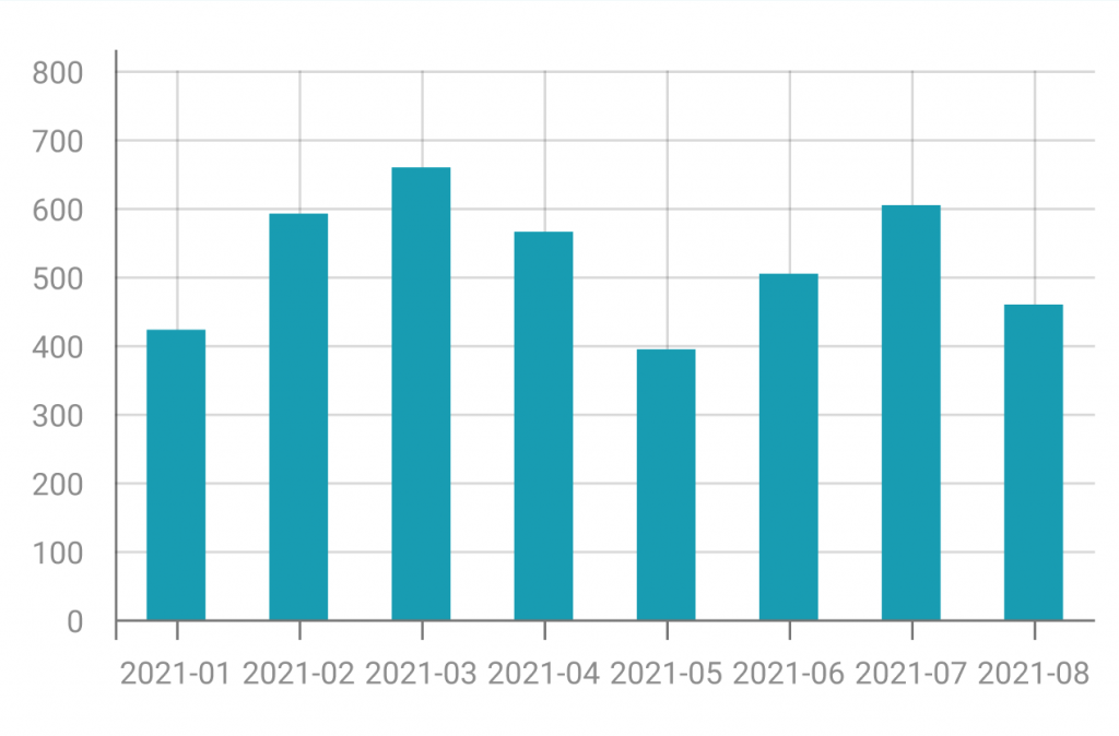
Within this section, you will encounter the best explainable visualisations to discern the relevant information crucial for predictions. The primary focus here is to assist in post-prediction analysis, aiding you in comprehending the significance of various factors once a prediction has been generated.

A bar/line chart combines features of bar and line charts, using bars for discrete categories and lines to indicate trends over a continuous scale.
It is useful for illustrating relationships between two datasets, allowing emphasis on individual values and the overall pattern in a single representation.

A bar chart has been used in XMANAI to compare the trend of a sensor real values and predicted values in a specific range of time to let the user compare the values and create trust in the XAI models used.


XMANAI Project Coordinator
Michele Sesana – TXT
e-mail: michele.sesana@txtgroup.com
XMANAI Scientific Coordinator
Dr. Yury Glikman – Fraunhofer FOKUS
e-mail: yury.glikman@fokus.fraunhofer.de
XMANAI Technical Coordinator
Dr. Fenareti Lampathaki – SUITE5
e-mail: fenareti@suite5.eu
TXT e-solutions S.p.A.
Via Frigia 27 – 20126 Milano
t: +390225771804