What features need to be changed to obtain a specific outcome?
This section will display the best explainable visualisations to indicate which features should be adjusted in order to enable users to make informed choices and optimize their path towards achieving a specific desired outcome.
Heatmap
Description
Example from XMANAI
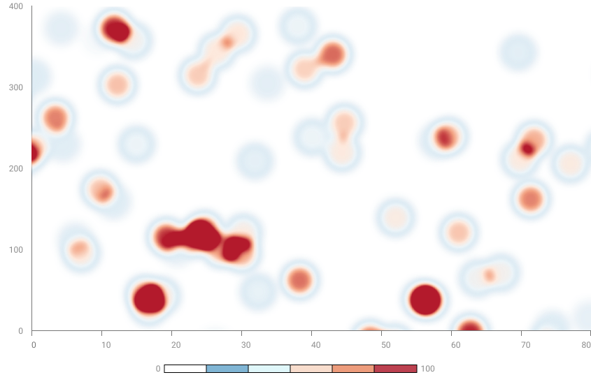
A heatmap is a visual representation of data in the form of a colored matrix, where colors indicate numerical values in the matrix cells. Typically, more intense colors represent higher or lower values depending on the context. Heatmaps are used to highlight patterns and relationships in data, making it easier to understand trends. They are often employed to visualize the correlation between variables in a dataset or to represent the distribution of values in a matrix.
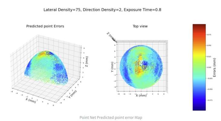
A 3D heatmap representation has been used in XMANAI to highlight the predicted measurement error on a spherical surface. The 3 axys (x, y, z) constitute the 3d space – expressed in mm – in which each error point is represented. The points are represented in a specific point of the space using a gradient color scale to identify the intensity of the error.
The XMANAI website uses cookies. By using our website and agreeing to this policy, you consent to our use of cookies in accordance with the terms of this policy.
This website uses cookies to improve your experience while you navigate through the website. Out of these, the cookies that are categorized as necessary are stored on your browser as they are essential for the working of basic functionalities of the website. We also use third-party cookies that help us analyze and understand how you use this website. These cookies will be stored in your browser only with your consent. You also have the option to opt-out of these cookies. But opting out of some of these cookies may affect your browsing experience.
Necessary cookies are absolutely essential for the website to function properly. This category only includes cookies that ensures basic functionalities and security features of the website. These cookies do not store any personal information.
Any cookies that may not be particularly necessary for the website to function and is used specifically to collect user personal data via analytics, ads, other embedded contents are termed as non-necessary cookies. It is mandatory to procure user consent prior to running these cookies on your website.