In this section, the best explainable visualisations to check the predictions’ level of confidence are displayed. Specifically, this section serves as a valuable resource for evaluating the robustness of predictions and enhancing your overall comprehension of the predictive outcomes.

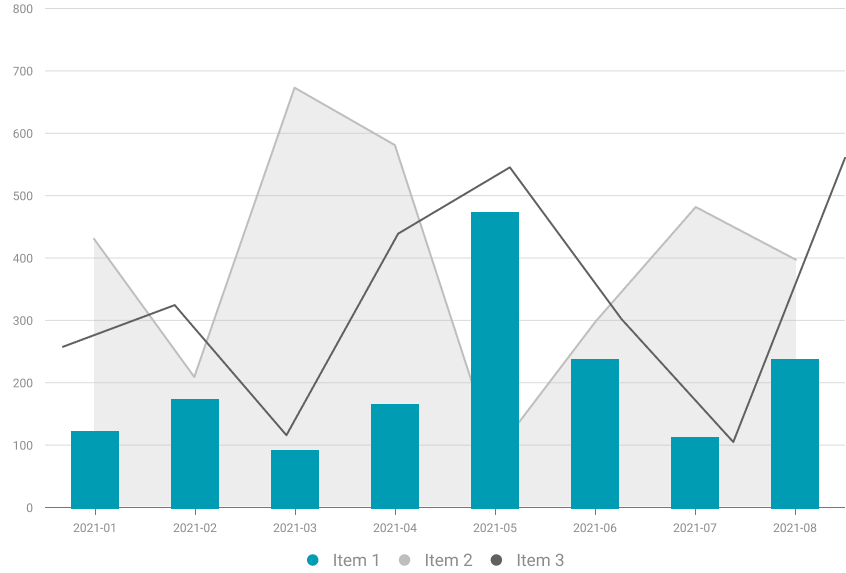
Mixed visualizations seamlessly combine various types of visualisations to offer users a comprehensive explanation. They prove particularly effective in presenting results and clarifying complex systems that involve diverse models and data, combining their outcomes for a cohesive understanding.

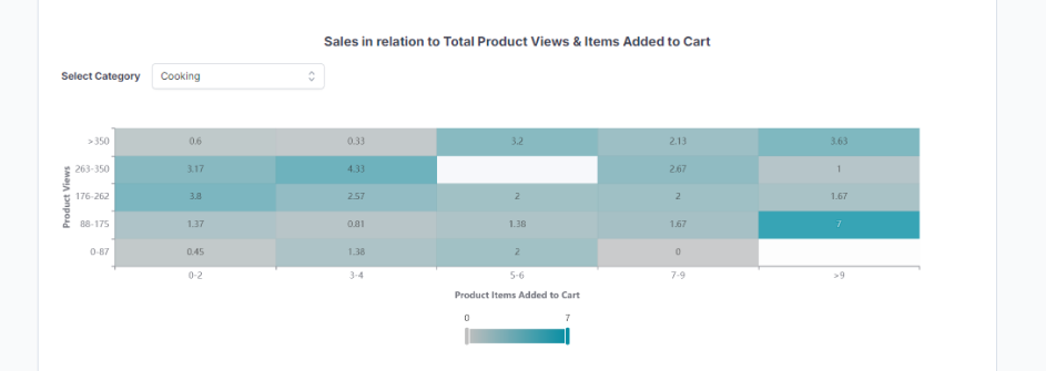
A mixed chart is employed by a XMANAI demostrator to illustrate the relationship between various data points. Specifically, it maps the quantity of items added to the online shopping cart along the x-axis, and the number of views on the company’s e-commerce website for a particular product category along the y-axis.


XMANAI Project Coordinator
Michele Sesana – TXT
e-mail: michele.sesana@txtgroup.com
XMANAI Scientific Coordinator
Dr. Yury Glikman – Fraunhofer FOKUS
e-mail: yury.glikman@fokus.fraunhofer.de
XMANAI Technical Coordinator
Dr. Fenareti Lampathaki – SUITE5
e-mail: fenareti@suite5.eu
TXT e-solutions S.p.A.
Via Frigia 27 – 20126 Milano
t: +390225771804