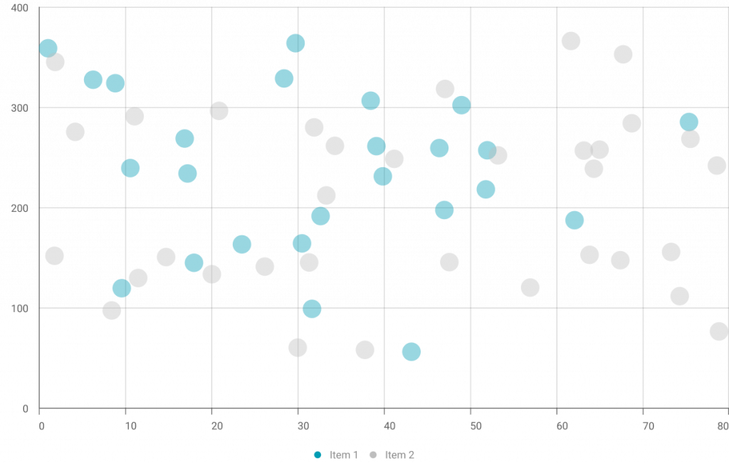
In this section, the best explainable visualisations to highlight the features influence are displayed. Specifically, this section will help you to show which variables carry more weight in the model’s predictions.

A scatterplot is a visual representation of data points on a two-dimensional plane, with each point indicating the values of two variables. It is used to identify relationships, trends or patterns between the variables, making it a visual way to assess the strength and direction of the relationship between variables and a valuable tool for exploring correlations and outliers in datasets.


XMANAI Project Coordinator
Michele Sesana – TXT
e-mail: michele.sesana@txtgroup.com
XMANAI Scientific Coordinator
Dr. Yury Glikman – Fraunhofer FOKUS
e-mail: yury.glikman@fokus.fraunhofer.de
XMANAI Technical Coordinator
Dr. Fenareti Lampathaki – SUITE5
e-mail: fenareti@suite5.eu
TXT e-solutions S.p.A.
Via Frigia 27 – 20126 Milano
t: +390225771804